
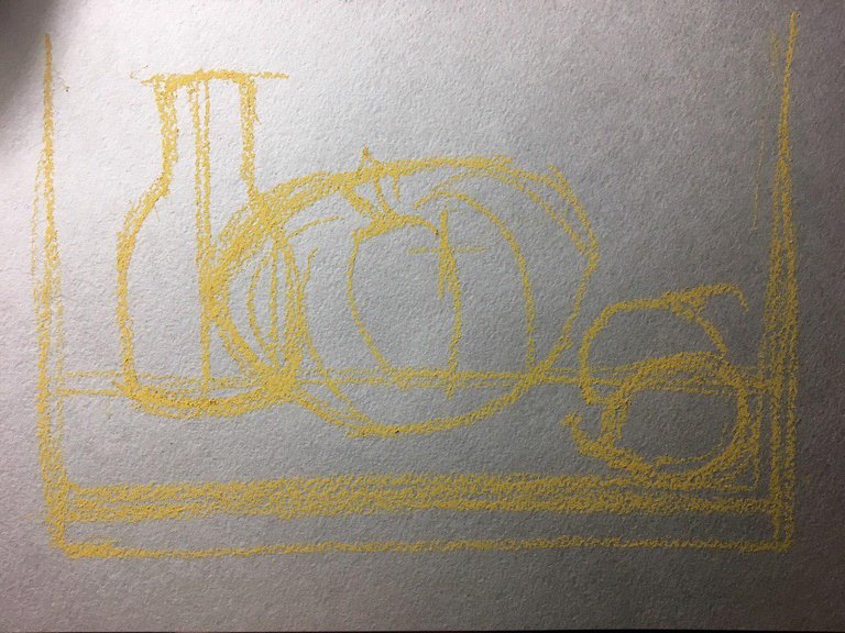
As in any picture, here, too, need a sketch. But its accuracy is completely unimportant. Moreover, when working with pastels, it is difficult and generally unnecessary to achieve a strict contour. All work is based on silhouettes and colors. Therefore, if your drawing looks confusing and incomprehensible - move a few steps away from work, and you will immediately see everything clearly. It is for this purpose that the color spots are used in the work, as if in a mosaic.
Step One: Sketch
At the very beginning you do not need to collect a lot of objects for still life. It is better to limit to two, maximum three objects. It is important to consider the size of the working space when placing items. The smaller it is - the smaller the number of items that can be present in the work.
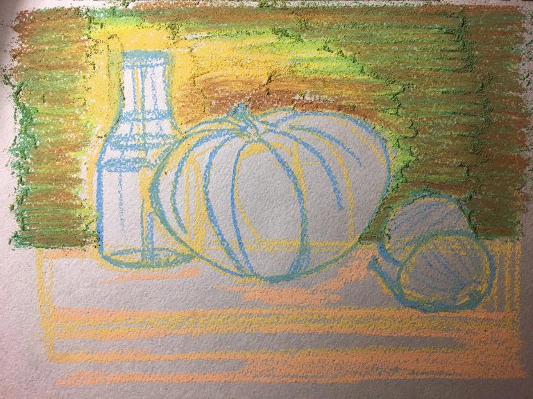
Step Two: Work with the Background
Anyone who has ever painted - knows the first rule of an art club: work from the general to the particular
And this means you first need to draw a background, and only then objects
First, the overall tone of the object, then its shape and at the end of its details
And one more small clarification: no contour
I always want to circle something or highlight. So here. Do not give in to this desire!
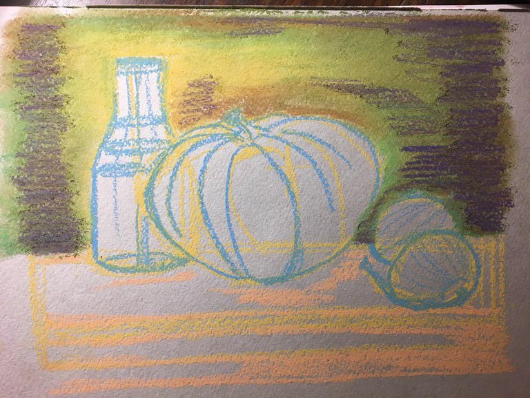
At this point, I add purple shadows to the edges.
Further in work I will constantly use shades of blue for shadows and yellow for color
Why?
The spectrum consists only of colored flowers, which means there is no white and black there. And if one of them appears in the figure - he immediately begins to “scream” and drag all his attention to himself. It is unacceptable. In pastels, harmony of colors is important. Because when viewing a picture, the brain is able to convey to us that dark blue is a shadow, and yellow is light.
Step Three: First object
The first object is always the one that is far away. The bottle is transparent, so in the next photo I adjusted the background to make it more uniform.
As you can see - all the glare on the glass I paint in yellow shades of pastel
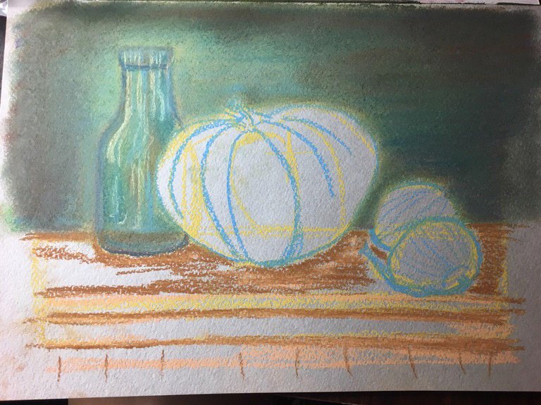
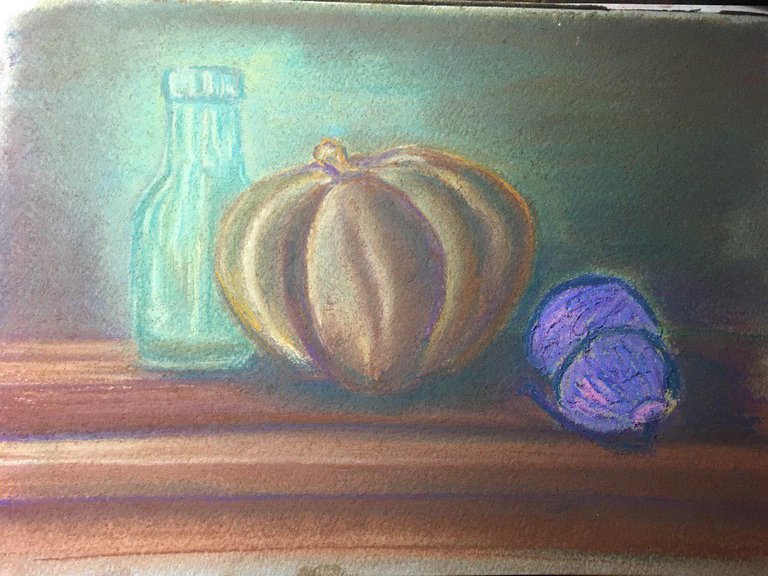
Step Four: The Second Object
I will adjust the first object in the process, but now I have decided to put light and shadows on the pumpkin
Again, I rubbed the color only after I applied everything I wanted.
On the table caused a dark green color to indicate the shadows.
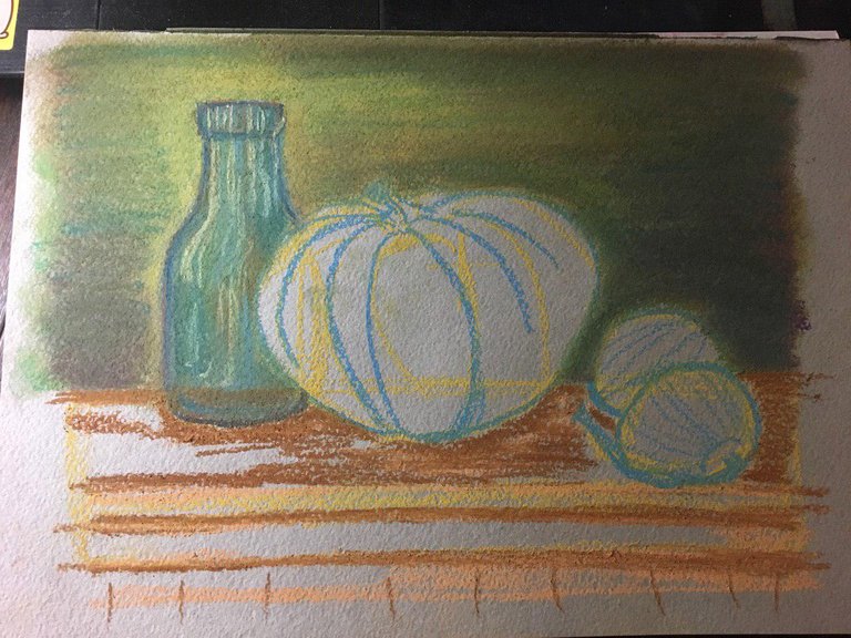
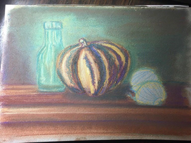
Step Five: the table \ foreground
Even though I wrote above that I need to work from the general to the particular, it does not work for me with the surface. Due to the fact that it is closer to me, and to the reference point on the hand - I always leave it on the penultimate place.
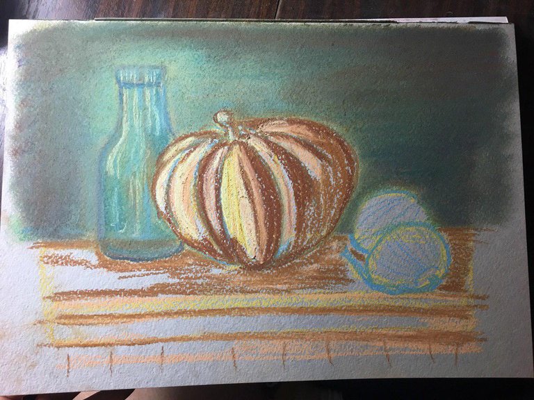
Now I am back to step four, to continue what I started with the pumpkin. Namely: give color.
Of course, it would be wrong to draw each of the objects separately from the furnishings, therefore, dark green and purple colors must necessarily be present on the objects.
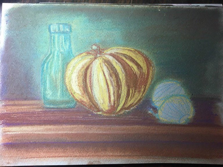
Step Six: The Third Subject
So I blur the colors on the pumpkin, place light-shadow accents and proceed to the last item in the picture - the bow.
In parallel, I clarify the shadows under the objects
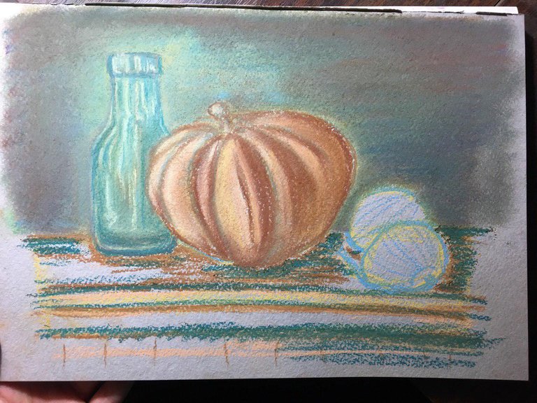
Using pink, scarlet, light purple, purple and light yellow (Neapolitan yellow), I outline the bow in general
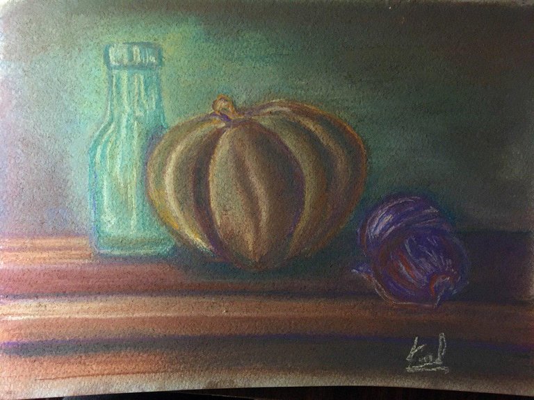
I correct the picture
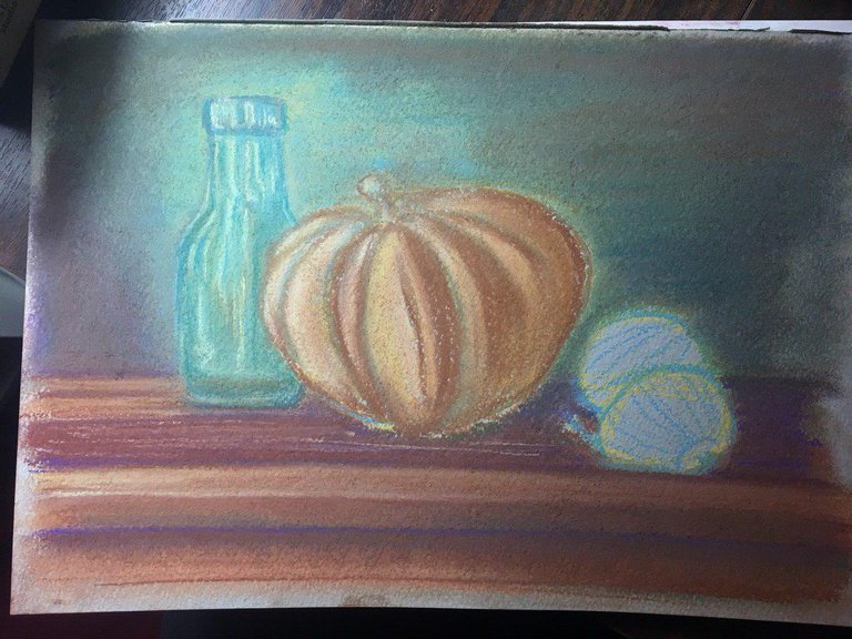
The final!
I hope this post does not seem TOO voluminous, and at least someone will read it) I just wanted to explain in as much detail as possible all the methods and techniques that I use when working with pastels. I hope this will help someone to draw their first little masterpiece.

